


Gray is still going strong as the go to neutral in many homes even with beige trying to make a comeback. The number one question I continue to receive in my inbox is, “What is the best Sherwin-Williams gray paint color?”
Usually, I send people to my top-read post here on the blog, The Perfect Gray Paint for any Home. This post was written after we finally found the Seattle paint formula so many had been searching for and it turned out to be the exact shade of gray we wanted for our home.
The problem with this paint is that it seems that based on the store where it’s mixed, you may go home with our exact Seattle color or one that has a hint of blue. I think this is because it’s a color from a paint brand that’s no longer around. It has left many readers thrilled with the newly discovered color and others disappointed when they can’t get the exact match.

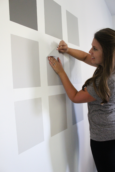
Since I can’t control how the paint is mixed, I can offer a new post featuring not one, but NINE, popular Sherwin-Williams gray paint colors that we put to the test. After a lot of time spent researching the most sought after gray paint colors, I headed to my local paint store and had them mix 8 different grays.
The ninth color is the extra Seattle paint I have left over from when we painted our home. These gray colors range from dark to light, cool to warm, and everything else in between.

.
Understanding Gray Paint Colors
Choosing a gray paint color is something that seems like it should be simple, but it can actually be really tricky! The key to finding the right gray paint color is to understand the undertones of gray paint and find the one that works with the lighting, decor and hard finishes in your space.
Undertones of Gray Paint Colors
Gray paint typically has one of three undertones:
- Gray with Blue Undertones: These are cool grays, thanks to their blue tones.
- Gray with Green Undertones: Green-grays tend to be warmer, thanks to their green tones.
- Gray with Violet Undertones: Violet-grays are warmer than blue, but a bit cooler than green.
While the undertones of gray paint colors aren’t always obvious, they become much clearer when you put them next to each other. As you look at the Sherwin-Williams gray paint colors we tested for this post, you’ll notice their undertones are much more clear when they are placed next to each other than they are looking at a single swatch.
This is why it’s so important to test a variety of paint colors in your space, at different times of day and alongside your furniture, flooring, trim color and decor.
9 Best Sherwin-Williams Gray Paint Colors Put to the Test
So, what is the best Sherwin-Williams gray paint color? The truth is that the answer isn’t that simple. While there are certainly popular grays from Sherwin-Williams, the best gray is really the one that looks best in your space.
We put 8 gray paint colors (plus a ninth we already used in our home) to the test so we could report back on what makes each one special. Here are the 8 we put on our white bedroom walls so that we could get the best results:

Testing Gray Paint Colors at Different Times of Day
As you know, paint always changes color throughout the day depending on the lighting. You paint your sample during the day and when the natural sunlight goes away, you’re left with the lighting from lamps or overhead lighting. All of a sudden your new favorite paint color looks horrible (or not what you fell in love with).
That’s why we took our post one step further and photographed the paint colors with natural daylight, at night with lamps on, and with just an overhead light on. Here’s what happened with the gray paint swatches in the different lighting:


You can clearly see that the colors change when the lighting source changes. Some stay within the gray hues while others tend to look more blue, purple, or even beige. This part of the post will help tremendously if you’re looking for a gray paint color that doesn’t show any hints of another color or if you’re okay with a gray that also looks slightly blue.
There’s no right or wrong answer, it’s really about choosing the best gray paint color for you and your home.
Here are a few of my thoughts and opinions on each color:
Sherwin-Williams Gauntlet Gray (SW 7019)

With it being a darker gray, Gauntlet seemed to stay consistently gray no matter the lighting source even though it has a brown/taupe base color. It’s a great color to use on an accent wall, in a room with a lot of natural light, and even as an exterior color for your home. If you’re looking for a gray charcoal color, this is it! You can see an example of Gauntlet Gray being used here.
Sherwin-Williams Dorian Gray (SW 7017)

Dorian Gray is a gray that’s a medium-toned color. It’s a warmer gray thanks to its undertones, which are really a mix of green and violet. At night it stays a true gray and during the day you can see the warmth this color provides. This particular paint color pairs great with medium-dark flooring and bright white trim. You can see an example of Dorian Gray used here.
Sherwin-Williams Mindful Gray (SW 7016)

Mindful Gray has just enough depth and very similar to Dorian Gray. They’re actually found right next to each other on a paint strip. If you love the undertones of Dorian Gray but want something slightly lighter, then you’ll want to try Mindful Gray. Keep in mind with it being slightly lighter, it can sometimes cast a very faint blue/purple hue. I barely noticed it! You can see an example of Mindful Gray here.
Sherwin-Williams Light French Gray (SW 0055)

Light French Gray has often been compared to Seattle (the paint color we’ve used throughout our home). They are very close in color but Light French Gray tends to have a cooler look to it. It can give off subtle hues, like blue for example, with the varying lighting sources. I mainly noticed this in the natural lighting. You can see an example of Light French Gray here.
Sherwin-Williams Repose Gray (SW 7015)

Repose Gray is a very well-known paint color and for good reason! The undertones of this color are subtly violet, but stay almost consistently the same throughout all of my photos and it’s light enough to work in almost any space.
From what I’ve heard about this color, the undertones can be slightly unpredictable and you might see faint beige or purple undertones depending where you apply this paint. Don’t confuse this paint color with a greige. It leans more towards a warm gray. See an example of Repose Gray here.
Sherwin-Williams Agreeable Gray (SW 7029)

If you’re looking for a greige (gray but sometimes looks beige) paint color, Agreeable Gray is one of the most popular ones. In fact, Agreeable Gray is consistently the most popular Sherwin-Williams gray paint color.
It has taupe undertones and I could certainly see that in my sample no matter the lighting source. This greige is definitely more gray than beige, but is still really warm. You’ll notice the gray undertones before you notice the taupe with this paint color. A great gray for you to look into that brightens a space while providing warmth. It’s a go to neutral! You can see an example of Agreeable Gray here.
Sherwin-Williams Worldly Gray (SW 7043)

Worldly Gray immediately looked like a beige more than a gray as soon as I placed it on the wall. It’s certainly a warm paint color and can sometimes pick up a subtle green undertone in certain lighting. I could see this color creating a very soft look in a space. See an example of Worldly Gray here.
Sherwin-Williams Passive (SW 7064)

Passive is known as one of the go-to light gray paint colors. As I observed this color throughout the day, at first it looked like it had a silver hue to it and then I quickly saw blue. Almost like an icy blue. This is probably because of the cool undertones. If you’re looking for a really light gray that can also look like a very light blue, this is the color for you. I love the idea of using Passive for a nursery or little kid’s room that can grow with them. You can see an example of Passive here.
Seattle by Frazee

As you probably already know, we used Seattle throughout all the main living areas of our home. It’s truly a warm, medium-light gray that doesn’t show any blue, purple, or green hues from daytime to nighttime lighting. I wanted to add this color to the group since so many wonder about this color. As you can tell in the pictures, it stays consistently gray. My go to and favorite gray paint! Read and see more about it here.
While Frazee Paint no longer exists, it was actually acquired by Sherwin-Williams. If you talk to your local Sherwin-Williams paint company you can ask them to make this hue using the color formula (which you can find in my full review of this color!). While it may not be a perfect match, it should be close!

Choosing The Best Gray Paint Colors for Your Home
I’m thrilled about this post because because when researching paint colors on Pinterest, for example, you only see a space painted in one gray color. It helps to see these gray paints right next to one another for comparison reasons. Also, when looking at rooms painted in a certain color you have to keep in mind some rooms you see online have more natural light than others.

Use this post as your guide to help you make a decision on one of these colors or even if it helps you say no to a few you were wanting to try. Every no is one step closer to saying yes to the perfect gray for your home!
FAQs About Choosing Gray Paint Colors
I had so many questions when choosing the best gray paint color for our home, so chances are you have a lot of questions too! Here are some of the most common questions I hear when talking about gray paint.
What is the most popular gray color at Sherwin-Williams?
Sherwin-Williams Agreeable Gray is generally considered to be the most popular gray color at Sherwin-Williams. Still, it’s important to remember that just because a color is popular doesn’t mean it will work in your space. If you have cool finishes and decor, Agreeable Gray may not look right as a warm gray paint color. Always test your paint colors in your space and alongside your existing finishes.
What is the most popular gray color right now?
Gray paint colors have been popular among homeowners for years, but the trends in which grays are most popular have definitely changed. Cooler grays were the favorite for many years (along with lots of cool white paint colors), but in recent years homeowners have been shifting to warmer hues of gray and white. If you want a warm gray paint color, look for grays with green undertones or greige paints that have plenty of warm beige in them.
How do you tell if a gray is warm or cool?
The best way to tell if a gray paint color is warm or cool is by paying attention to the undertones. Gray paints with blue undertones are the coolest grays out there, while gray paints with green undertones are the warmest. Grays with violet undertones can lean warmer or cooler. Be sure to test paint colors in your space and at different times of day to see how the color shifts as the lighting does.
Let’s keep in touch!
We have a brand new community over on Facebook, House & Home, where we’ll be chatting, sharing, and helping one another when it comes to home decor and projects. Come join us! Check it out here.
Like on Facebook || Follow on Instagram || Follow on Pinterest

[…] View ImageMore Like This […]
I am so glad it helped!!
[…] View Image More Like This […]
[…] for more paint inspiration? Check out these posts on the best gray paints, best white paints and how to get a clean paint line every […]
[…] Original Source […]
Hello from Argentina! I found your blog through pinterest and I lovef it! I am in the process of chosing color for my home and I want to use a light neutral in the whole house. I am thinking on modern gray by SW but I’m not sure if it will turn out too dark… I loved the method you used of painting a swatch to see how the paint would look on different lights, is that paper you painted on? Or what was it? I’d love to do the same.
[…] Download Image More @ withinthegrove.com […]
[…] **If white paint isn’t the color you’re looking for, check out this post where we tested different gray paints. […]
Picked my gray color- on the rocks- a lighter version of LFG, but now I have to choose a carpet color ( can’t splurge on wood floors) I haven’t a clue on what color to go with! Any ideas anyone ?
I am confused between repose gray and agreeable gray. Please help me select one!
Thank you for taking the time to do this! We are re-modeling a living room/kitchen area and I came home yesterday to find the “gray gray” we thought was gray was very, very blue. I was a bit horrified. I started researching online everywhere and stumbled across your site this morning. Having to pay for a repaint, and more paint, but the Seattle ended up being the perfect color for me as well!
I hate it when that happens!! Especially when you originally thought you loved the color. I’m thrilled to hear Seattle worked out for you!
This is so useful! I just helped my mom with painting her room and bathrooms grey this past weekend – finding the exact right shade of grey is no easy task!
Thank you Lindsey! That was my goal and so happy that it helped you. What color did you guys go with?
So awesome how you showed the entire process of choosing which grey to go with!
I had a blast creating it! Thanks for stopping by!
Such a great way to test the colors!! You guys really did your research!
So kind of you! Thank you!
This awesome! who knew picking out a grey paint color could be so stressful?! You made my life a little easier haha!
So glad this post could help! Picking out a paint color is certainly a job in itself.
It’s so interesting to see how the colors change of natural light, nighttime light at indoor lighting.
They change SO much!
Thanks for this! Funny that in my house LFG looks nearly identical to Seattle, but ever so minutely LESS blue, which is opposite to what you’ve found. Ah well, the joys of lighting!
How crazy is that?? I love paint but it can be equally as frustrating. I remember needing another gallon to finish a room, came home after getting a new can mixed, and it was a shade off. Same formula and everything. And you’re right, lighting is such a huge factor as well! Thank you for checking out the post today, Jackie!