


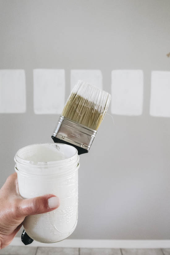


If you’ve ever tried to pick a white paint color for your dining room, living room, kitchen (or any other space!) then you know how challenging it can be. When we were choosing our dining room paint color, I knew I wanted it to be a soft, creamy white, so I put some of the most popular white paint colors from Sherwin-Williams and Benjamin Moore to the test.
When I was designing this room, I waited until we finalized the table, chairs, rug, and other decor items before deciding on a paint color for the walls. Knowing we wanted to go with a white, I sampled 5 of the most popular white paint colors that caught my eye.
- Alabaster: Sherwin-Williams
- Simply White: Benjamin Moore
- Snowbound: Sherwin-Williams
- White Dove: Benjamin Moore
- Cloud White: Benjamin Moore

5 Popular White Paint Colors from Sherwin-Williams and Benjamin Moore
Before we start exploring the best white paint colors I’ve tested in my home, it’s important to keep in mind that paint colors can change space to space.
How these colors appear in my home may differ from how they look in yours. Natural light, colors already present in the room, east versus west facing room, etc. can have an effect on the paint color. So, to give you a better idea of each paint color, here are a few examples of each one and how they look in different homes – plus lots of details about each color to help you choose the one that’s right for you!
1. SHERWIN-WILLIAMS ALABASTER
Sherwin-Williams Alabaster is a warm white and is oftentimes compared to Benjamin Moore White Dove. It’s a beautiful creamy white if you’re looking for a white that isn’t too stark and wanting to add a little warmth to a space.
Pictured below is a master bedroom by Brittany of Addison’s Wonderland. She actually painted the trim and the walls in Alabaster. The second image is by the very talented Jenna Sue of Jenna Sue Design. She used Alabaster throughout her entire home.


SW Alabaster Facts
- Color Code: SW 7008
- LRV: 82
- Undertones: Strong yellow
- Pair With: Soft black, warm grays, green and natural wood floors
Alabaster vs White Dove
One of the most common comparisons I saw when researching popular white paint colors was SW Alabaster vs BM White Dove. They’re both beautiful, creamy white paint colors but they do have some key differences.
Alabaster has stronger yellow undertones, so it looks creamier on the wall. White Dove, on the other hand, has yellow undertones but it is more muted, so it looks softer on the wall and its undertones are not as pronounced.
If you’re deciding between these two colors, make sure to test them both in your space to see how they look in your natural light.
2. BENJAMIN MOORE SIMPLY WHITE
If you’re looking for a bright, clean white then Simply White is the white paint for you. Simply White is a crisp off-white paint color with strong yellow undertones. In a room with a lot of natural light, the undertones are not as obvious. But in a room with dim light, the yellow undertones keep this color looking warm and bright.
It doesn’t have any undertones and is very crisp. It would also be great to use on the trim in your home. Sara of Life on Virginia Street painted her office in Simply White and paired it with a beautiful navy accent wall. I love how it turned out! And then there’s Studio McGee. They have used Simply White for several of their projects. I love how they’ve used it on walls and trim!


BM Simply White Facts
- Color Code: OC-117
- LRV: 89.5
- Undertones: Strong yellow
- Pair With: Warm blues, natural wood floors, crisp white trim colors
BM Simply White vs BM Cloud White
One of the most common comparisons I saw when researching popular white paint colors was BM Simply White vs BM Cloud White.
They’re both warm white paint colors and can work in a lot of the same spaces. But Simply White is lighter and brighter than Cloud White, which is darker with creamier taupe undertones.
3. SHERWIN-WILLIAMS SNOWBOUND
Snowbound has a hint of gray undertones in some lighting. This would be a great white for you to use if you’re looking for a slightly cooler white to use in your home.
Sherwin-Williams Snowbound has a hint of gray undertones in some lighting, which makes it look muted on the wall. This would be a great white for you to use if you’re looking for a slightly softer, cooler white to use in your home.
In the first image below, City Farmhouse has used Snowbound in their living room. They have Pure White throughout the rest of their home and thought Snowbound would pair perfectly with it. As for the second image, Lauren of Lauren Smyth Design has done an amazing job using Snowbound in this kitchen. It’s certainly a showstopper space!


SW Snowbound Facts:
- Color Code: SW 7004
- LRV: 83
- Undertones: Gray
- Pair With: Muted grays, cool blues and soft blacks
SW Snowbound vs BM White Dove
Sherwin-Williams Snowbound is often compared to Benjamin Moore White Dove because they are both muted white paint colors with plenty of gray in them. But despite their similar softness on the wall, they’re actually very different colors.
BM White Dove is muted, but still has a clear yellow undertone and looks warm and cozy on the wall. Snowbound, on the other hand, appears much cooler. In certain light, Snowbound can have a taupe, or almost pink, undertone, so be sure to test it in your space before ordering.
4. BENJAMIN MOORE WHITE DOVE
Benjamin Moore White Dove is a creamier white paint color that can show a slightly yellow undertone in some lighting. It is certainly a favorite among many! Jennifer Ferrandi has used it throughout most of her home and you can see it in the first image with her beautiful entryway. You can see how stunningly creamy it is! And Pike Properties has shown us how it looks in the main living space. You can truly playoff fo White Dove with so many other colors within your decor.


BM White Dove Facts:
- Color Code: OC-17
- LRV: 85.4
- Undertones: Soft yellow
- Pair With: Warm gray paint colors, greens and warm blues, earthy finishes
BM White Dove vs BM Cloud White
Benjamin Moore White Dove and Benjamin Moore Cloud White are both creamy white paints and they’re often compared when testing the best white paint colors for dining rooms and more. But they’re actually pretty different.
White Dove has a lot more gray in it than Cloud White, so it looks more muted and softer on the wall. The less-creamy White Dove makes it a great color for spaces without much natural light. Cloud White works better in brighter rooms.
5. BENJAMIN MOORE CLOUD WHITE
Cloud White was a close contender with Alabaster for me. They are both very similar with their creamy hue without showing other undertones. Cloud White is just a tad bit lighter than Alabaster. This color goes beautifully with just about any color palette. Cloud White on this shiplap in Most Lovely Thing’s breakfast nook has certainly caught my eye! And then the way Driven by Decor used it in her living room makes it look fresh and inviting.


BM Cloud White Facts:
- Color Code: OC-130
- LRV: 87.4
- Undertones: Yellow
- Pair With: Black accents, colorful art, natural wood
Benjamin Moore Cloud White vs Sherwin-Williams Alabaster:
Both paint colors are very similar with their creamy hues. Cloud White is just a tad bit lighter than Alabaster. Alabaster also looks more yellow on the wall so if you’re looking for a creamy white paint color that won’t look yellow, Cloud White may be a better choice.
Which White Dining Room Color Did We Choose?
All of these popular white paint colors are gorgeous whites to use in your home. We ultimately decided to go with Alabaster for our dining room. We have a lot of natural light that pours into the dining room space and didn’t want a stark white.

I love how this paint color goes with the decor we picked out for this space. It’s the perfect foundation for the warm black-and-white palette we created in this room. Cloud White is definitely a new favorite white paint color for dining rooms!
How to Choose the Right White Paint Color for Your Home
There are a lot of things to consider when choosing the best white paint color for your home. Here are a few things to think about:
Pay attention to the natural light.
Different whites can appear warm or cool depending on the lighting conditions. If your space receives plenty of natural light, cooler whites with blue or gray undertones might complement the brightness, creating a crisp and fresh feel. In contrast, rooms with limited natural light may benefit from warmer whites with hints of beige or yellow to add warmth and prevent the space from feeling too dark.
Consider your hard finishes.
Pay attention to the existing elements in your room, such as furniture, flooring, and fixtures. It’s essential to choose a white paint color that works with these elements and doesn’t clash. Compare paint samples to your existing decor and furniture to see how they interact in different lighting conditions.
Always test your paint colors.
Don’t forget to test the paint samples on your walls before making a final decision. Paint can look different on a small sample card compared to a large wall surface. Take note of how the color appears in different lighting throughout the day and how it complements the overall aesthetic you’re looking for.
Let’s keep in touch!
We have a brand new community over on Facebook, House & Home, where we’ll be chatting, sharing, and helping one another when it comes to home decor and projects. Come join us! Check it out here.
Like on Facebook || Follow on Instagram || Follow on Pinterest

I am having my kitchen painted in cloud white in about 2 weeks. I know the look I am looking for and know I will be pleased with this color white.
[…] for more paint inspiration? Check out these posts on the best gray paints, best white paints and how to get a clean paint line every […]
Thanks for this helpful post. Whites can be so tricky. I wanted a warmer look and went with Moderate White which is creamy. Good luck!